

8 Step PMS Color Matching Workflow With ΔE Thresholds for Brand Teams

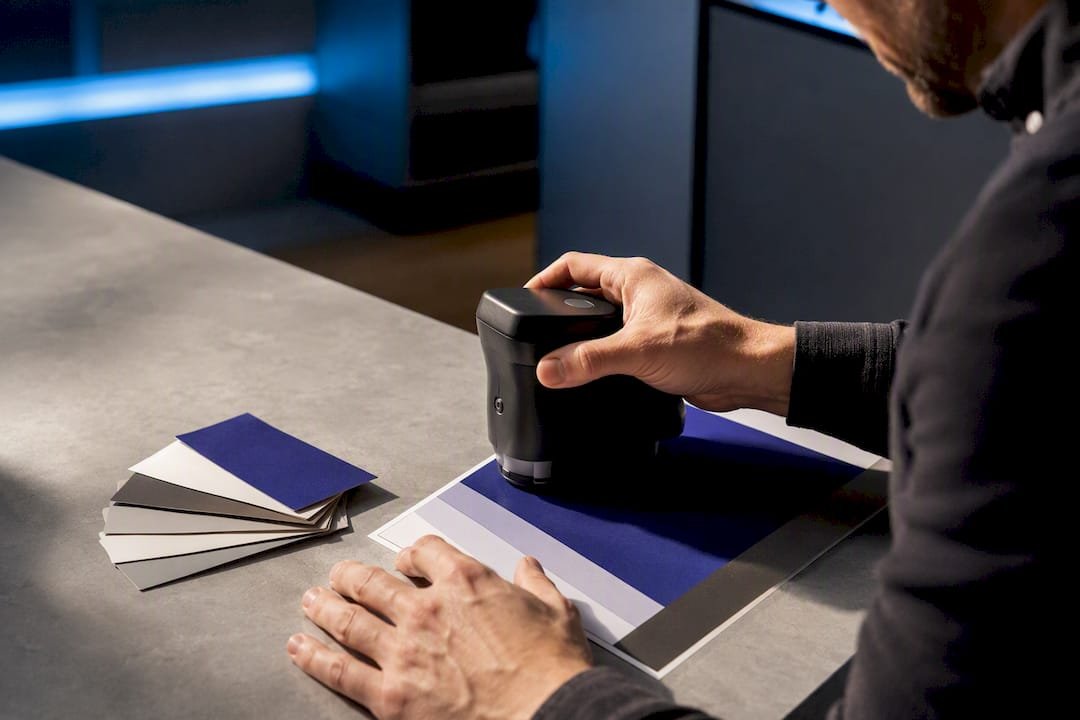
The reliable path from screen to spot ink is technical, not visual: convert your digital color to CIE Lab, rank Pantone candidates by CIEDE2000 ΔE, then confirm the winner against a physical Pantone guide or a press proof. Skip the physical check and you’re gambling on a monitor’s opinion of what “brand blue” looks like. Pantone Color Finder, Color Bridge, and PantoneTools converters get you to a shortlist fast; only a printed chip or proof gets you to a decision you can put in a purchase order.
TL;DR:
- Conversion from screen to print color relies on measuring in CIE Lab space and ranking Pantone matches by the lowest CIEDE2000 ΔE score.
- Physical checks using Pantone chips or proofs are crucial, especially for metallic, embroidered, or textured surfaces, because visual matches under inconsistent lighting can be misleading.
- Monitor and digital tools provide fast shortlists, but final color approval should always occur on the actual material and under controlled D50 lighting conditions to avoid errors.
- Matching PMS colors across materials requires specifying the substrate and finish to vendors, with physical samples and clear sign-off processes preventing significant discrepancies.
- Relying solely on digital ΔE scores is insufficient; ordering physical chips or proofs on real substrates is essential for accurate and consistent brand color reproduction.
Table of Contents
- Where to Find a Fast, Reliable PMS Color Match
- How Digital Colors Actually Map to a Pantone Number
- Why the Same PMS Number Looks Different on Different Materials
- A Step-by-Step Checklist From Screen Color to Print-Ready PMS
- What Discountswag Recommends for Branded Merchandise Color Approval
- Why the Conventional PMS Advice Falls Short
- Get Brand-Accurate Merchandise Without the Color Guesswork
- Sources
Where to Find a Fast, Reliable PMS Color Match
Start digital, finish physical. That’s the entire logic behind which tool to reach for at each stage of picking a Pantone number.
For quick lookups, Pantone’s own Color Finder lets you search by name, number, or a rough visual match, and it’s the fastest way to confirm a PMS code someone already handed you. When you need to cross-reference a spot color against its closest CMYK or RGB build, the Pantone Color Bridge guide is the industry’s accepted answer. It’s a physical (and digital) reference specifically built to show how a spot ink translates into four-color process, and it belongs on the desk of anyone specifying color for both litho and digital output, according to Modeinfo’s breakdown of the Color Bridge system.
If you’re capturing color from a physical object rather than a screen, the Pantone Color Match Card pairs with the Pantone Connect app to scan a surface with a phone camera and return a match with near-device-reader accuracy. It won’t replace a spectrophotometer, but it beats eyeballing a swatch under office lighting.
For the math itself, converters like PantoneTools take a HEX or RGB value, calculate its position in CIE Lab space, and return the Pantone colors with the lowest CIEDE2000 ΔE. Here’s when to use what:
- Client-facing quick check: Pantone Color Finder or a HEX to Pantone converter for a same-day answer.
- Cross-media consistency (print + digital + apparel): Pantone Color Bridge guide.
- Capturing an existing physical color: Pantone Color Match Card with Connect.
- Production sign-off: physical Pantone Formula Guide, full stop.
None of these tools replace each other. They cover different moments in the same decision.
How Digital Colors Actually Map to a Pantone Number
Your monitor’s HEX code and a printed Pantone chip live in two different color universes, which is why a naive comparison between them is close to meaningless. Here’s the actual pipeline professionals use.
First, sample the pixel and record its sRGB HEX value. Second, linearize that sRGB signal, because monitors apply a gamma curve that distorts raw numbers. Third, convert the linearized values into CIE XYZ using the D65 illuminant, the standard daylight reference most screens are calibrated against. Fourth, convert XYZ into CIE Lab, a color space built to match human perception more closely than RGB ever could. Fifth, run CIEDE2000 ΔE against the full Pantone reference set and rank candidates by the smallest ΔE score.

Why not just compare HEX values directly, or measure raw distance between RGB numbers? Because RGB space isn’t perceptually uniform. Two colors can sit close together numerically and look wildly different to the human eye, while two colors far apart numerically can look nearly identical. Lab space, and CIEDE2000 specifically, corrects for that by weighting differences the way your eye actually perceives them.
The ΔE score is the number that turns this into a decision. Based on thresholds widely used across color conversion tools, a ΔE under 1 is imperceptible and safe to send to production without further review. A ΔE of 1 to 2 is barely perceptible and usually fine for most brand work. Between 2 and 5, the shift is visible to a trained eye and needs a stakeholder to sign off before you commit. Above 5, you’re looking at a rework, an extended-gamut process, or a custom ink mix.
One more wrinkle: if your brand color originated as a Lab measurement from a spectrophotometer or a press sheet, convert directly from Lab to Pantone. Routing it through RGB first adds rounding and gamut errors you don’t need.
Why the Same PMS Number Looks Different on Different Materials
A PMS number is not a fixed appearance. It’s a formula, and formulas react to whatever surface they’re printed, dyed, or embroidered on.
Pantone splits most of its library into coated © and uncoated (U) versions for exactly this reason. Coated stock reflects light differently than uncoated stock, so the same ink recipe produces a noticeably different result depending on the paper. Always match the guide finish to your actual production substrate. If your packaging is uncoated kraft stock, checking a coated chip will mislead you every time.

Textiles and plastics complicate things further. Embroidery thread has a limited chroma range compared to printed ink, so a saturated PMS number might need to be approximated with a slightly desaturated thread color, a limitation worth flagging early in production rather than discovering it on a finished polo shirt. Screen-printed apparel behaves differently again, and metallic inks introduce sheen and reflectivity that no flat color chip can fully represent.
Lighting is the final variable, and it’s the one most people ignore. Color comparisons should happen under a D50 standard illuminant, ideally in a proper viewing booth, because ambient office lighting or daylight through a window will shift how a color reads, sometimes dramatically. That’s a core reason professionals use controlled viewing conditions rather than trusting a glance under fluorescent tubes, as Datacolor’s guidance on color matching points out.
- Match the Pantone guide finish (C or U) to your actual substrate.
- Request the exact same material for physical proofs, not a similar stand-in.
- Compare colors only under D50 lighting or a viewing booth when the decision is brand-critical.
Pro Tip: If a color is genuinely brand-critical, ask your vendor for a wet proof or a physical sample on the actual production substrate before final sign-off. A PDF proof on your screen tells you almost nothing about how ink will sit on cotton or how thread will catch light.
A Step-by-Step Checklist From Screen Color to Print-Ready PMS
Run this sequence every time a new color needs to go from a design file to a production ticket.
- Extract the color. Grab the HEX or RGB value with a screenshot or an eyedropper tool and record it exactly.
- Convert to Lab. Run the value through a converter that linearizes sRGB and calculates CIE Lab coordinates.
- Rank Pantone candidates. Compute CIEDE2000 ΔE against the Coated or Uncoated library, whichever matches your substrate, and note the top candidates.
- Check the ΔE score. Anything under 2 is generally safe; 2 to 5 needs sign-off; above 5 means rework or a custom mix.
- Toggle substrate and finish. Re-run the comparison if you’re switching between paper, textile, or plastic.
- Order a physical sample. Get a Pantone chip or a preproduction sample on the real material.
- Approve under controlled light. Sign off under D50 lighting or request a wet proof for anything brand-critical.
- Document everything. Record the accepted PMS number, substrate, finish, and proof type directly on the purchase order.
Tell your vendor exactly four things: the PMS number, the substrate, the finish, and your acceptance ΔE threshold. That short list prevents most of the back-and-forth that stalls print jobs.
What Discountswag Recommends for Branded Merchandise Color Approval
Ordering a batch of branded polos, tumblers, or tech accessories carries more color risk than a single print run, because you’re often matching one PMS number across several materials at once. An effective approval flow follows the same logic outlined above in three stages: a digital proof to confirm the intended color and layout, a preproduction sample to test the actual material, and a final sign-off before the full order goes into production. The approval steps guide walks through exactly what to check at each stage.
A few production issues come up repeatedly:
- Ink saturation shifts on textiles compared to how the same PMS number appeared on paper.
- Metallic finishes on drinkware or tech items can vary in sheen between production runs.
- Embroidered thread has a narrower color range than print, so highly saturated brand colors sometimes need a documented substitute shade.
Build in time for sample approval, especially on multi-location orders where color consistency matters across every shipped batch. Rush proofs are available when timelines are tight, but they compress the review window, so flag brand-critical colors early rather than after the preproduction sample ships.
Why the Conventional PMS Advice Falls Short
Most guides treat PMS matching like a lookup problem: type in a HEX code, get a Pantone number, done. That’s backwards. The conversion math (Lab, CIEDE2000, ΔE) is the easy part, and any decent converter handles it in seconds. The part everyone skips is the verification step, and that’s exactly where brand-critical mistakes happen.
A ΔE score under 2 feels like permission to move straight to production. Often it is. But that number describes a mathematical prediction, not a printed result. It says nothing about how metallic ink catches light on a tumbler or how embroidery thread compresses a saturated red into something duller. The Pantone Matching System’s own guidance exists precisely because formulas behave differently across materials, which is a caveat digital-only workflows tend to bury in fine print.
If you take one thing from this, prioritize the physical check over the digital score. Order the chip. Get the proof on the real substrate. The math gets you to a strong short list; the sample gets you to a decision you can defend when a stakeholder asks why the mugs don’t quite match the website.
— Jerry
Get Brand-Accurate Merchandise Without the Color Guesswork
Once you’ve settled on a PMS number, the harder part is getting a vendor to hit it consistently across polos, tumblers, and tech accessories in the same order. An established vendor builds every quote around the approval flow described above: digital proof first, physical preproduction sample second, and a documented sign-off before full production starts, so you’re never relying on a screen to make the final call. That structure matters most when a single order ships branded items to several offices at once and every location needs to see the same color.
Browse the types of branded promotional products available from distributors, from apparel to drinkware to tech gear, and request a quote with your PMS number, substrate, and acceptance threshold listed up front. That single step, giving your vendor the exact spec instead of a HEX code, is what turns a color guess into a color guarantee.
Sources
- HEX to Pantone Converter — PantoneTools
- Pantone Color Finder
- Color match in design and industry — Datacolor
 Bottle Carriers
 Mugs
Mugs