

Why Font Matters on Branded Products: A Marketer’s Guide


Font choice on a product changes how customers judge that product — often before they read a single word. That’s not a design opinion; it’s how human perception works. Typography encodes meaning visually, and consumers process that meaning faster than they process copy.
Here’s the short version:
- Recognition: Consistent type across packaging, merch, and digital touchpoints builds recall even without a logo present.
- Trust: Font style signals whether a brand belongs in its category. A mismatch creates friction that erodes confidence.
- Legibility: A font that looks sharp on screen can become unreadable at 8-point on a curved bottle or stitched into a polo.
- Sales signal: Typography influences perceived quality and price-point expectations before a customer picks up the product.
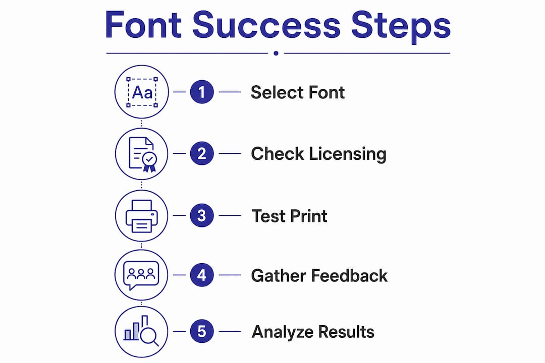
Three things you can do this week:
- Pull your current branded product and hold it at arm’s length. Can you read every line of text without squinting? If not, your body font is failing.
- Check your font license. Open the EULA or license file and confirm it covers print and merchandise use — not just web or desktop.
- Print a physical proof of your next product at actual production size and substrate. Compare it to your screen mockup. The gap is usually instructive.
Table of Contents
- What is a brand font system, and why does it belong on your products?
- How fonts shape perception, trust, and commercial outcomes
- Why do some fonts fail on product surfaces?
- What U.S. regulations and accessibility standards constrain your font choices?
- How do you build a product-ready brand font system?
- What font licensing do you need to check before printing branded merchandise?
- How do you test fonts on products and measure what’s actually working?
- Checklist for choosing and approving fonts for a branded product
- Applying this workflow with Discountswag for promotional merchandise
- Key Takeaways
- The part most brand managers skip
- Discountswag makes branded merchandise easier to get right
- Useful sources and further reading
What is a brand font system, and why does it belong on your products?
Typography is the art and technique of arranging type. In practical marketing terms, it covers typeface selection, sizing, spacing, weight, and hierarchy. A typeface is the design family (think: Helvetica, Garamond); a font is a specific instance within that family (Helvetica Bold 12pt). Marketers use “font” for both, and that’s fine.
A brand font system organizes typefaces into roles: a primary display face for hero use (product name, headline), a secondary face for supporting copy (descriptors, taglines), and a tertiary face for regulatory and body text (ingredients, instructions, legal). Some systems add a numeric or condensed variant for data-heavy contexts like nutrition panels.
Product typography is where the system gets tested hardest. On a package or a promotional item, every role must perform simultaneously, often within a few square inches. Consider two versions of the same coffee bag: one set in a high-contrast serif with tight tracking, the other in a rounded geometric sans. The serif reads as artisan and premium; the sans reads as approachable and modern. Same product, same price, entirely different purchase signal.
“Typography accompanies packaging, digital interfaces, and advertising and helps unify brand identity via repeated exposure — making it a primary driver for building brand recall.”
— American Marketing Association
That repetition effect compounds on physical products. Every time a customer sees your packaging on a shelf, your merch on a colleague’s desk, or your branded bag at an event. The type reinforces the same visual voice. Over time, the typeface itself becomes a brand asset.
How fonts shape perception, trust, and commercial outcomes
The psychology here is well-documented. Typography is encoded both as image and as text — what researchers call the picture-superiority effect — which means it binds to memory more reliably than copy alone. A consistent typographic system across packaging, web, and merchandise builds recognition faster than ad hoc logo use.
Font psychology provides reliable shortcuts that consumers apply instantly. High-contrast serifs read as luxury and trust. Geometric sans-serifs read as modern and technical. Script fonts read as handcrafted or emotive. When the font contradicts the category expectation, consumers feel cognitive friction — they can’t quite articulate why the product feels off, but they put it back on the shelf.

Category fit matters as much as aesthetic quality. A typeface that signals luxury can actively harm perceived value for a budget-focused product line. Consumers categorize products in milliseconds, and typography must support that immediate, accurate signal. A premium serif on a $4 energy drink creates confusion; a rounded playful sans on a $200 skincare set does the same.
The business implications are real. Industry sources consistently report that brand consistency across touchpoints correlates with measurable revenue improvement, though the magnitude varies by category and execution quality. What’s consistent across the evidence: brands that optimize typography as part of a system — rather than choosing fonts ad hoc per product — outperform those that don’t on recognition and perceived quality metrics. The role of branded merchandise in that system is often underestimated; a well-typed promotional item keeps the brand visible long after the initial campaign ends.
Pro Tip: When evaluating a font for a new product, show a printed mockup to five people outside your team and ask them one question: “What kind of brand do you think this is?” Their answers will tell you whether your typography is sending the right category signal.
Why do some fonts fail on product surfaces?
Screen-perfect display fonts fail on physical products for a predictable set of reasons. Ink bleed on absorbent substrates widens strokes and closes counters (the open spaces inside letters like “e,” “o,” and “a”). Dot gain in offset printing does the same. Embroidery converts letterforms into thread paths, which means thin strokes and tight curves simply disappear at small sizes. Curved surfaces on bottles and drinkware distort letterforms that look fine on a flat mockup.
Each production process has its own tolerance profile:
| Process | Key risk | Minimum stroke weight | Counter sensitivity |
|---|---|---|---|
| Offset lithography | Dot gain closes counters | — | High |
| Digital print | Color shift at edges | — | Medium |
| Screen printing | Ink spread on fabric | 1pt+ | High |
| Heat transfer | Edge softening | — | Medium |
| Embroidery | Thread density limits detail | 2pt equivalent | Very high |
| Laser engraving | Thin strokes disappear | 1pt+ | Low |
The practical implication: a font family with multiple weights is not a luxury. It’s a production requirement. You need a heavier weight for embroidery and screen print, a lighter weight for digital print on smooth stock, and a condensed variant when space is tight on a label. Families like those available through Adobe Fonts or Google Fonts often include the weight range you need; the question is whether the license covers your production method.
PKG Brand Design recommends testing packaging typography for readability at three distances: 6 feet (shelf recognition), 3 feet (browsing), and arm’s length (decision point). Each distance requires a different size and weight strategy.

Pro Tip: Before approving any embroidered item, request a physical stop-stitch test at actual production size. Ask your vendor to run the test on the same fabric weight you’re ordering. A digital embroidery preview will not show you thread-path failures.
What U.S. regulations and accessibility standards constrain your font choices?
For any product with a nutrition facts panel, the FDA sets a minimum 8-point type size for nutrition facts text. Allergen statements typically require bold treatment or a larger size for emphasis. Experts and accessibility practitioners recommend 10–12 points as the threshold for comfortable reading across age groups, particularly for older consumers.
Beyond the nutrition panel, the broader accessibility picture matters commercially. Products targeting older adults, vision-impaired consumers, or accessibility-conscious buyers need conservative contrast ratios. The Web Content Accessibility Guidelines (WCAG) recommend a 4.5:1 contrast ratio for body text — a standard that translates directly to print when you’re designing for legibility rather than aesthetics. Light text on a photographic background is a common failure point on premium packaging.
The practical design solution is role separation. Reserve your expressive display font for the product name and hero headline, where it can be large enough to carry personality without sacrificing legibility. Use a clean, open-counter secondary font for descriptors and variant names. For regulatory text — ingredients, warnings, directions — use your most legible tertiary font at a size that meets or exceeds FDA minimums, and never go below 10 points if your audience includes older shoppers.
One thing many brand managers miss: regulatory minimums are floors, not targets. Meeting the 8-point minimum for a nutrition panel while using a condensed, low-x-height font still produces a label that’s technically compliant but practically unreadable. Compliance and legibility are not the same standard.
How do you build a product-ready brand font system?
A minimal product-ready font system has four slots, each with a defined job:
- Primary display: Your brand’s personality font. Used for the product name, hero headline, and any large-format identity use. Can be expressive, distinctive, even unusual — but must hold up at the sizes it will actually appear on your products.
- Secondary headline: A supporting face for product descriptors, variant names, and section headers. Should complement the primary without competing. Often a different weight of the same family, or a well-paired companion.
- Tertiary body/regulatory: The workhorse. Used for ingredients, instructions, legal copy, and any text below 12 points. Must have strong x-height, open counters, and clear differentiation between similar characters (I, l, 1). This is not the place for personality.
- Numeric/condensed variant: For data-heavy contexts — nutrition panels, size charts, pricing — where space is constrained and number legibility is critical.
Shopify’s brand typography guidance frames this as a hierarchy system: each font role supports a different level of the information architecture, and the system only works when every role is filled intentionally.
Dos and don’ts for your product font system:
- Do limit your system to two typeface families maximum. Three is almost always too many.
- Do choose families with at least four weights (light, regular, medium, bold). Single-weight fonts are production liabilities.
- Don’t use your display font for body copy. Ever.
- Don’t pair two serif faces or two geometric sans faces. The similarity creates visual noise without hierarchy.
- Do document minimum sizes, color pairings, and spacing rules in your brand guidelines — not just the font names.
- Don’t commission custom type until you’ve exhausted licensed options. Custom typefaces from major foundries cost $50,000–$300,000 to develop; that budget is rarely justified until brand scale demands it.
- Do include a section in your brand guidelines specifically for product and merchandise use, separate from digital and advertising rules.
For brand consistency across merch SKUs, the font system entry in your guidelines should specify: which font appears on which product type, minimum sizes per production method, and which weights are approved for embroidery versus print.
What font licensing do you need to check before printing branded merchandise?
Font licensing is where brand managers get surprised, and the surprises are expensive. Most fonts come with a desktop license, which covers use on your computer and in print files you produce yourself. It does not automatically cover merchandise, large print runs, or products for resale.
The license types that matter for branded products:
“License terms must cover packaging usage rights — many web-only licenses don’t extend to packaging applications. For brands without custom typeface budget, careful selection from licensed type families with strong character provides distinctive options.”
- Desktop/print license: Covers internal documents and print collateral. Usually sufficient for small-run marketing materials, but check quantity thresholds.
- Webfont license: Covers use on websites. Does NOT cover embedding in apps or use on physical products.
- App/embed license: Covers fonts embedded in software or digital products. Separate from print.
- OEM/merchandise license: Covers use on physical products for sale or distribution. This is what you need for branded merch, packaging, and promotional items. Many foundries require this separately, and some charge per unit or per print run above a threshold.
Before approving any print run, confirm these five items in the license documentation:
- Does the license explicitly permit use on physical merchandise or packaging?
- Are there quantity limits per license tier? (Some licenses cap at 500 or 1,000 units.)
- Does resale or distribution of the product trigger a different license category?
- Is embedding permitted if the font appears in a digital file sent to a printer?
- What happens if you exceed the licensed quantity — is there a surcharge, or does the license void?
Monotype and other major foundries publish detailed licensing documentation. Google Fonts uses the SIL Open Font License for most of its library, which is permissive for commercial use including print and merchandise — but read the individual font license, because exceptions exist. Adobe Fonts licenses are tied to your Creative Cloud subscription and generally cover print use, but merchandise and large-run commercial distribution may require an additional agreement.
The red flag to watch for: fonts licensed “for personal use only” that appear in free font libraries. These are common, they look professional, and using them on a commercial product without upgrading the license is a legal exposure.
How do you test fonts on products and measure what’s actually working?
Testing fonts on physical products requires a different protocol than testing digital assets. The goal is to validate legibility, brand fit, and commercial signal before committing to a full production run.
A repeatable test protocol:
- Physical mockups first. Print your top two or three font options at actual production size on the actual substrate (or the closest available proxy). Hold them at the distances PKG Brand Design recommends: 6 feet, 3 feet, and arm’s length. Note which options fail at any distance.
- On-shelf photo test. Photograph the mockups in the environment where the product will live — a shelf, a trade show table, a desk. Review on both a desktop monitor and a phone screen. Fonts that look strong in isolation often disappear in context.
- A/B landing page test. For products sold online, create two versions of the product page with different typography treatments and run a split test. Track time-on-page, scroll depth, and add-to-cart rate. Even a two-week test with modest traffic produces directional data.
- Short-run soft launch. For high-stakes products, produce a small run with two font variants and distribute to a test market or internal panel. Collect structured feedback on perceived quality, readability, and brand fit.
Metrics worth tracking after launch: brand recall in post-purchase surveys, return rates attributed to label confusion, click-through rates on product images in digital ads, and customer service contacts about label legibility. None of these are perfect proxies, but together they build a picture of whether your typography is working.
For A/B tests, a practical minimum is 200 exposures per variant before drawing conclusions. Smaller samples produce directional signals, not decisions. If you’re testing on a product page, isolate the typography variable — don’t change the image or copy at the same time, or you won’t know what moved the needle.
Checklist for choosing and approving fonts for a branded product
Run through this before any production sign-off:
Selection
- [ ] Font fits the brand’s category signal (luxury, modern, approachable, technical)
- [ ] Primary display font tested at actual production size on actual substrate
- [ ] Secondary and tertiary fonts confirmed legible at minimum production sizes
- [ ] Font family includes at least four weights
- [ ] No more than two typeface families in the system
Production QA
- [ ] Physical proof reviewed at 6 feet, 3 feet, and arm’s length
- [ ] Embroidery stop-stitch test completed (if applicable)
- [ ] Stroke weights confirmed above process minimums (see production table above)
- [ ] Counters and open letterforms verified on curved or textured substrate
- [ ] Files converted to outlines or fonts embedded before sending to vendor
Legal and licensing
- [ ] License type confirmed as covering physical merchandise/packaging
- [ ] Quantity limits checked against planned print run
- [ ] Resale/distribution clauses reviewed
- [ ] License documentation saved to project file
Accessibility and regulatory
- [ ] Nutrition facts / regulatory text at or above 8-point minimum (FDA)
- [ ] Body and regulatory text at 10–12 points for accessibility
- [ ] Contrast ratio meets 4.5:1 for body text
- [ ] No condensed or decorative fonts used for small regulatory copy
Approval sign-off
- [ ] Brand manager: font system compliance confirmed
- [ ] Legal/procurement: license documentation reviewed
- [ ] Production vendor: file specs and proof approved
- [ ] Accessibility reviewer (if applicable): legibility confirmed
Timeline and budget notes: Allow two to three weeks for physical proof cycles. Font licensing upgrades for merchandise use typically cost $200–$2,000 depending on the foundry and run size; budget this before finalizing the production quote, not after.
Applying this workflow with Discountswag for promotional merchandise
The gap between a brand guideline and a finished promotional product is where font decisions either hold or fall apart. Here’s how a typical workflow runs when a brand manager works with a distributor like Discountswag.
From brief to proof:
- Brand manager submits brand guidelines (font files or names, color values, logo files) along with the product brief
- Discountswag’s production team reviews the files for process compatibility — checking stroke weights, minimum sizes, and substrate fit for the chosen product type
- A digital proof is produced and shared for approval; for embroidered items or complex print, a physical sample is recommended before full run approval
- Any font issues (stroke too thin for embroidery, counter closure risk on a curved drinkware item) are flagged at proof stage, not after production
What Discountswag can provide:
- Production-specific recommendations on font weight and size for the chosen item
- Physical sample proofs for high-volume or high-stakes runs
- QA review of submitted files against production specs
- Guidance on substrate and material choices that affect font performance
For promotional product types ranging from wearables to drinkware to tech accessories, the font constraints differ by item. A bold sans at 14 points works on a tote bag; the same font at 8 points on a pen barrel needs a heavier weight and wider tracking to survive the print process. Discountswag’s team flags these differences before production, not after.
Luxury brand positioning on promotional items benefits from the same font discipline as retail packaging. Working with a luxury marketing agency on the brand side while Discountswag handles production execution keeps the creative intent intact through the production process.
Key Takeaways
Font choice is the single fastest signal a product sends about brand quality, category fit, and trustworthiness — and it operates before a customer reads a word.
| Point | Details |
|---|---|
| Typography signals category fit | A font misaligned with its product category creates cognitive friction that reduces purchase consideration. |
| Production constraints are real | Embroidery, screen print, and curved substrates require heavier stroke weights and open counters to survive the process. |
| FDA minimums are floors, not targets | Regulatory text must meet the 8-point FDA minimum, but 10–12 points is the practical accessibility threshold. |
| License before you print | Confirm your font license covers physical merchandise and check quantity limits before approving any production run. |
| Discountswag flags font issues early | Discountswag reviews submitted files for production compatibility and provides physical proofs before full-run commitment. |
The part most brand managers skip
The conventional wisdom on brand typography focuses almost entirely on aesthetics: pick something that looks right for your category, pair it well, and you’re done. That framing misses the part that actually costs money.
The real risk in font decisions for physical products isn’t choosing the wrong style. It’s choosing a font that was never designed to survive the production process you’re running it through. A beautiful editorial serif that renders perfectly in a PDF will close its counters in screen print, lose its thin strokes in embroidery, and bleed into illegibility on an uncoated stock. By the time you see the problem, you’ve already approved the proof.
The second mistake is treating licensing as someone else’s problem. Font licenses for commercial merchandise are not automatically included in a desktop or web license. The foundry doesn’t chase you down — they just have a legal claim if you’re audited or if a competitor notices. The fix takes 20 minutes: open the EULA, search for “merchandise,” “product,” or “distribution,” and confirm the scope. If it’s ambiguous, email the foundry. They respond quickly and the upgrade cost is almost always less than the legal exposure.
The third mistake is the one I see most often in brand governance: no one owns the font decision. The designer picks the font, the brand manager approves the look, legal reviews the trademark, and nobody checks the license for the production method. Assign one person — usually the brand manager — to own font compliance from selection through production sign-off. Put it in the brand governance doc. The checklist in this article is a starting point.
Discountswag makes branded merchandise easier to get right
If you’ve worked through this guide and you’re staring at a production brief, a font file, and a list of product types, Discountswag is the practical next step. As a distributor of corporate promotional products, Discountswag handles the production translation — taking your brand files and turning them into merchandise that actually looks the way your guidelines say it should.
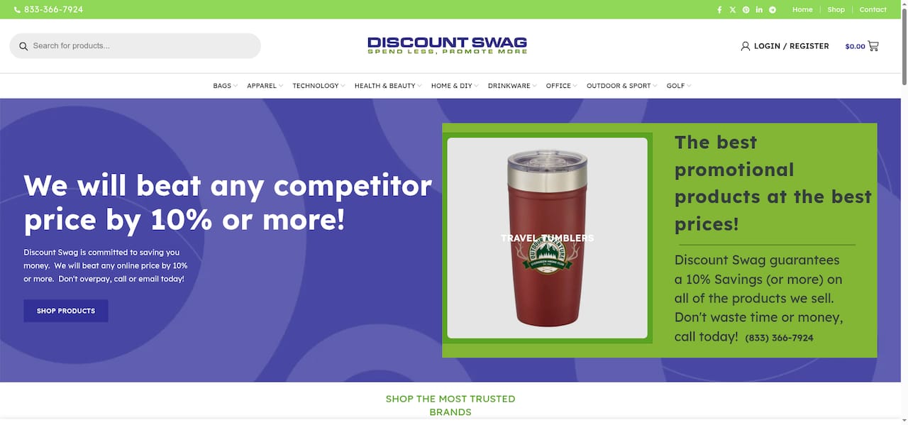
The production team reviews submitted files for font compatibility before proofing, flags stroke-weight and substrate issues before they become reprints, and provides physical samples for high-stakes runs. For brand managers who need promotional items for brand awareness that hold up across dozens of product types and print processes, that pre-production review is where mistakes get caught.
Request a quote or sample pack directly through Discountswag’s website. Bring your brand guidelines, your font files, and your product list — the team will tell you what works and what needs adjustment before anything goes to press.
Useful sources and further reading
-
FDA food labeling guidance: The primary regulatory source for nutrition facts type size minimums (8-point) and labeling requirements. Essential for any brand producing food, supplement, or regulated product packaging in the U.S.
-
American Marketing Association — Why typography matters for your brand: Accessible overview of typography’s role in brand recall and identity, grounded in marketing practice rather than design theory.
-
FontsArena — Font psychology in packaging design: Research-backed analysis of how font selection drives first impressions and perceived product quality on packaging.
-
Shopify — Brand typography guide: Practical walkthrough of primary, secondary, and tertiary font roles and how to build a usable brand font system. Good starting point for building or auditing your own system.
-
Confetti Design — Typography branding guide: Covers cognitive fluency, emotional associations by font category, and how to align typography with brand personality. Useful for the psychology section of any brand audit.
-
PKG Brand Design — Packaging typography checklist: Production-focused checklist with specific guidance on multi-distance readability testing (6 feet, 3 feet, arm’s length) and hierarchy rules for packaging.
-
Kittl — Why typography is important to branding: Practical guidance on role separation — expressive fonts for identity, restrained fonts for regulatory and body copy — with specific notes on tertiary font selection for small sizes.
-
Superside — The importance of typography in branding: Short, clear explainer of typography’s emotional impact and its role in unifying brand image across platforms and product types.
-
DelightAD — How to choose fonts for packaging: Practitioner perspective on font selection for packaging, with specific notes on licensing clarity, legibility at small sizes, and longevity over trend.
-
Interaction Design Foundation — Typography: Academic and practitioner reference for typography fundamentals, including cognitive and perceptual research underpinning font psychology claims.
 Bottle Carriers
 Mugs
Mugs