

Stop Reprints: Shirt Logo Sizes and Pixel Specs for Merch Teams

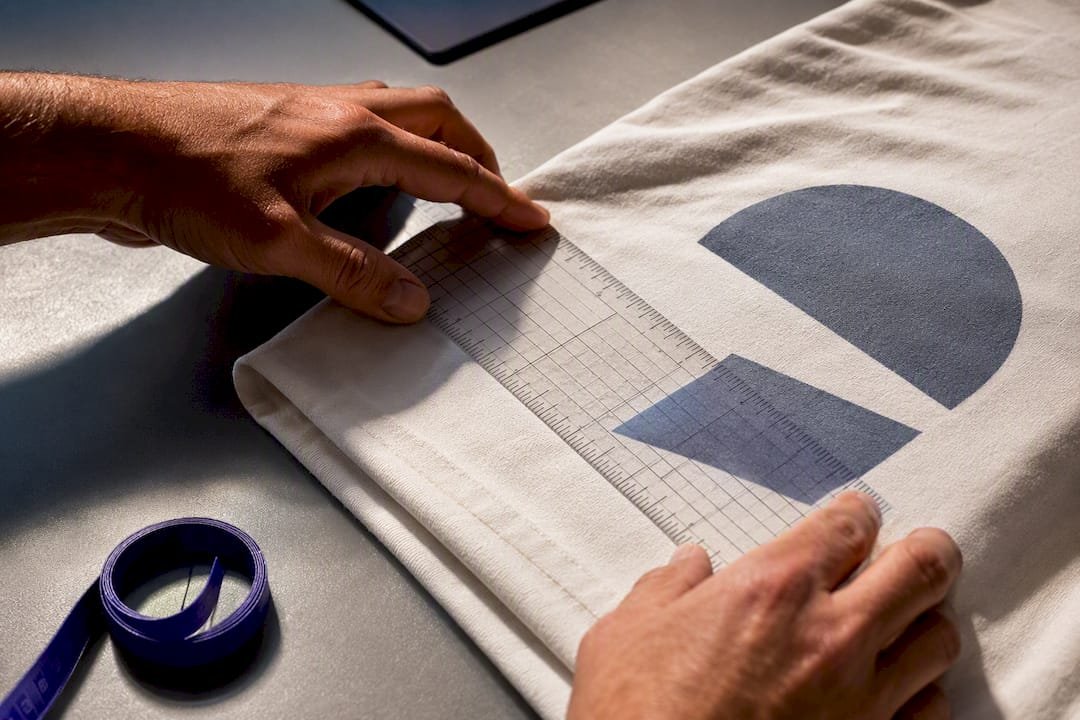
Use about 3.5 to 4 inches wide for a left-chest logo, 8 inches for center chest, and 10 to 12 inches for a full front on an adult shirt. Sleeve and back-neck logos usually stay under 3.5 inches. Before anything gets printed, confirm the printer’s template and print area, then build your art file at that exact size, at 300 DPI or as vector artwork. That one step prevents most reprints.
TL;DR:
- Logos on the left chest should be 3.5 to 4 inches wide, roughly the size of a shirt pocket, to ensure proper proportion and avoid looking awkward.
- For full front prints, design sizes typically range from 10 to 12 inches in width, with a maximum printable area of about 12 by 16 inches, depending on the garment size.
- Placement from the collar seam should be about 3 to 4 inches for most designs, with clearances of 1.5 to 2 inches from side seams and hem for full-front logos.
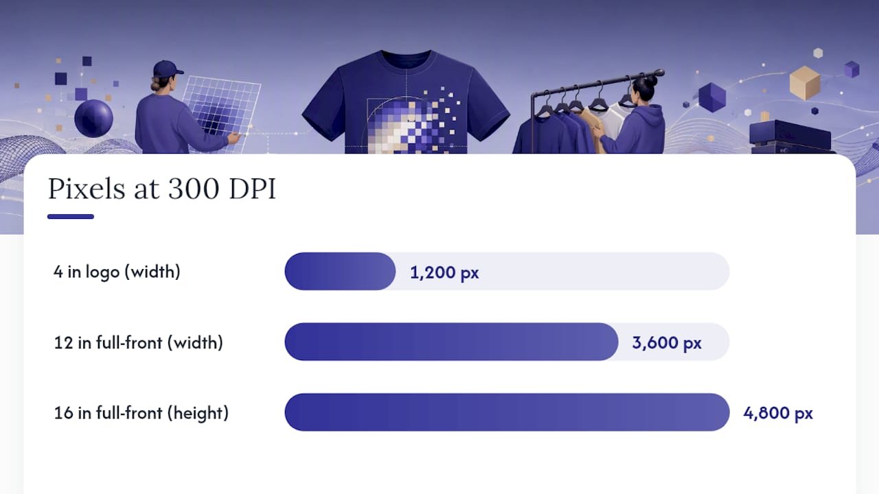
- Artwork should be created at 300 DPI, matching the final print size in pixels (for example, 4 inches equals 1,200 pixels), to prevent softness or pixelation in print.
- Bulk orders require checking the smallest shirt size first to ensure the design fits proportional to the garment, and using separate, scaled files for youth sizes to maintain visual consistency.
Table of Contents
- What Size Should a Logo Be on a Shirt?
- Where Exactly Should a Logo Sit on a Shirt?
- How Do You Prep Files at the Right Resolution?
- Sizing Logos Across Different Shirt Sizes and Styles
- How Decoration Method Changes Your Size Limits
- Pre-Order Checklist That Cuts Down Reprints
- Common Mistakes to Avoid When Sizing a Logo
- Keeping Logo Branding Consistent Across Sizes and Styles
- When to Go Subtle vs. Bold With Logo Size
- Getting Your Logo Sized Right on Bulk Orders
- Where to Check Size and File Specs Before You Order
- Sources
- FAQ
What Size Should a Logo Be on a Shirt?
Every placement on a shirt has a practical size window, and going past it usually causes the same two problems: the design looks slapped on, or it gets cut off by the seam. The ranges below come from how printers actually template their machines, not from guesswork.
Left chest logos run 2.5 to 5 inches wide, with most landing around 3.5 to 4 inches, according to Printful’s placement guide. That’s roughly the size of a standard shirt pocket, which is exactly the point. Center chest designs typically run 6 to 10 inches wide, with 8 inches a common sweet spot for a bold but not overwhelming look. Full front prints on adult shirts usually sit in the 10 to 12 inch range, and the maximum printable canvas for a full front is commonly about 12 by 16 inches, per Shopify’s logo placement breakdown. Full back prints run a bit larger, often 10 to 14 inches tall, since there’s more uninterrupted fabric to work with. Sleeve and back-neck placements are the smallest of the bunch, usually 2 to 3.5 inches, limited by the narrow, curved surface.
Here’s how those ranges translate to a working chart:
| Placement | Typical size range | Common starting point |
|---|---|---|
| Left chest | 2.5–5 in wide | 3.5–4 in |
| Center chest | 6–10 in wide | 8 in |
| Full front (adult) | 10–12 in wide | 11 in |
| Full back | 10–14 in tall | 12 in |
| Sleeve | 2–3.5 in wide | 3 in |
| Back neck | 2–3 in wide | 2.5 in |
| Youth/toddler chest | 2.5–3.5 in wide | 3 in |
Youth and toddler shirts need their own math. A logo sized for an adult small will look oversized on a youth medium, so scale chest designs down to roughly 2.5 to 3.5 inches for kids’ sizes, and check the shirt’s actual chest width before finalizing anything.
Once you know the size in inches, you need the pixel count to match, since printers work in resolution, not inches alone. At 300 DPI, a 4 by 4 inch logo needs to be 1,200 by 1,200 pixels. A 12 by 16 inch full-front design needs 3,600 by 4,800 pixels, a figure confirmed by Kapa99’s file-spec guide. Undersize the pixel dimensions and the print comes out soft or blocky, no matter how good the design looks on screen.
Bigger isn’t automatically better. A logo that fills the entire print area edge to edge tends to look bulky and amateurish, an effect designers at Merch Titans specifically warn against. Drop down a size when the design has small text or fine detail that needs to stay legible up close. Go bigger when the goal is pure visibility, like event merch meant to be recognized from across a room.
Where Exactly Should a Logo Sit on a Shirt?
Placement rules matter as much as size, because a well-sized logo in the wrong spot still looks off. These distances are measured from the collar seam, not the shoulder.
- Left chest: Position the top of the design about 3 to 4 inches below the collar seam, roughly where a shirt pocket would sit, and 2 to 3 inches in from the vertical centerline of the body. If the shirt has an actual pocket, align the logo’s center with the pocket’s center, not the armhole.
- Center chest: Sit the design about 3 to 3.5 inches below the collar, centered exactly on the shirt’s vertical midline. Off-center center-chest prints are one of the most noticeable placement errors, since the eye catches asymmetry fast.
- Full front: Start the top of the artwork 3 to 4 inches below the collar and leave at least 1.5 to 2 inches of clearance from each side seam and from the hem. That breathing room keeps the design from looking stretched when the wearer moves.
- Full back: Use the same 3 to 4 inch drop from the collar, but you can extend the design further down since there’s no chest curve to work around.
For a low-tech but reliable check, cut a piece of paper to your intended logo size, tape it to the actual shirt, and step back six feet. If it looks balanced from a normal viewing distance, the math is right. To confirm centering, fold the shirt in half vertically and check that the logo edges are equal distance from the fold on both sides.
Pro Tip: Measure on the actual garment, not a flat template photo. Stretch, shrinkage, and fabric weight all shift where “centered” actually looks centered once the shirt is worn.
How Do You Prep Files at the Right Resolution?
Print size is the final measured size of your logo once it’s on the shirt. Print area is the maximum canvas the printer allows for that placement, and the two are not the same thing, a distinction Shopify’s guide makes clear before any size decision. A 12 by 16 inch print area doesn’t mean your logo has to be 12 by 16 inches. It means that’s the ceiling.
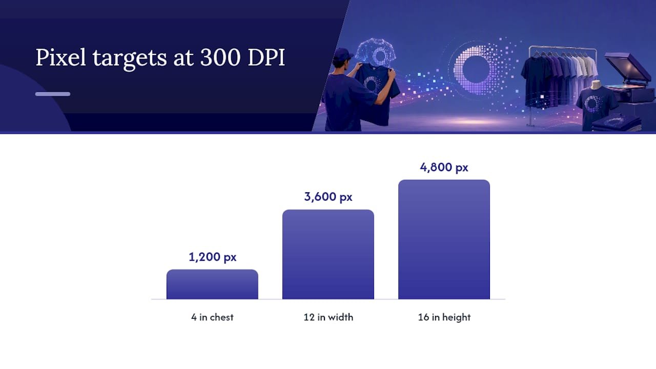
The conversion math is simple: multiply your intended inches by 300 to get pixels at 300 DPI. A 4 by 4 inch chest logo becomes 1,200 by 1,200 pixels. A 12 by 16 inch full front becomes 3,600 by 4,800 pixels, exactly what Kapa99 recommends for a crisp, non-pixelated result.
- Build raster art at the final print size, not smaller and scaled up later.
- Save logos as vector files (.AI, .EPS, or .SVG) whenever possible, since vectors resize without losing quality.
- Use PNG with a transparent background only for raster elements like photos or textured graphics.
- Set color mode to CMYK for most print methods; screen print shops may request Pantone spot colors separately.
- Include a short spec sheet with your order: file format, dimensions in inches, DPI, and color codes.
Here’s the number that matters most: a design built at 150 DPI instead of 300 DPI will print visibly softer, even though it looks fine on a laptop screen. If a printer says they’ll accept lower resolution, get that in writing before approving the order.
Sizing Logos Across Different Shirt Sizes and Styles
Running a bulk order with sizes from small to 3XL doesn’t mean you need six different logo files. Check your smallest garment first. If a chest logo at 11 inches wide still fits comfortably on the smallest shirt in the run without crowding the seams, that same file usually works fine straight through to XL.
- One standard size, often 10 to 11 inches for full front, typically covers adult small through XL without redesigning anything.
- Youth sizes almost always need a separate, smaller file. The chest width on a youth medium is significantly narrower than an adult small.
- Polos and shirts with embroidered pockets need simplified, smaller artwork, usually capped around 3 to 4 inches, since embroidery machines can’t replicate fine detail the way screen printing can.
- Oversized or boxy-fit shirts can handle a slightly larger design, since there’s more flat surface area to work with.
- Slim-fit or fitted shirts should size down slightly, since the fabric curves more and a large flat design will distort with movement.
The goal is proportional consistency, not identical dimensions. A logo that reads as “medium sized” on a small shirt and “medium sized” on an XL shirt, relative to the garment, looks intentional. One that’s identical in raw inches across every size often looks tiny on the XL and cramped on the small.
How Decoration Method Changes Your Size Limits
Screen printing, direct-to-garment (DTG), embroidery, and heat transfer each have their own rules about how small a logo can go before detail disappears.
- Embroidery has a practical minimum for small text and fine lines, since a stitch has physical thickness that ink doesn’t. Convert thin outlines into filled shapes before sending art to an embroidery machine, and expect small chest logos under 3 inches to lose intricate detail.
- Screen print and DTG both struggle with tiny text and fine halftone gradients on small placements like sleeves or back necks. Keep stroke widths thick enough to survive at the printed scale, generally no thinner than about 1 to 2 points at final size.
- Heat transfer and vinyl hold crisp edges well but need a minimum line thickness to avoid peeling or cracking over time, particularly on thin serif fonts.
- Request a digitized stitch preview for embroidery orders or a color-separation proof for screen print jobs before committing to a full production run.
- Order a physical sample any time the design includes small text, fine gradients, or metallic thread, since screen previews don’t always predict real-world results.
Pro Tip: If your logo has fine detail and you’re set on embroidery, ask about a simplified “embroidery version” of your logo. Most decorators can create one that keeps the brand recognizable without losing stitches to gaps that are too small to fill. For polo orders specifically, comparing embroidered polos against printed tees ahead of time helps set realistic size expectations before art goes to production.
Pre-Order Checklist That Cuts Down Reprints
A short checklist before submitting a bulk order catches most of the mistakes that lead to reorders and delays.
- Confirm the printer’s template and printable area for your exact garment and placement before finalizing size.
- Build your artwork at the final print size, at 300 DPI, or supply vector files so the printer can scale cleanly.
- Approve a digital mockup, and request a physical sample for embroidery or any design with fine detail.
- Write exact placement measurements in inches directly into the order notes, not just “center chest.”
- Flag the smallest shirt size in your run so the decorator sizes the art to fit that garment first.
- Include Pantone codes or color-matching notes if brand color accuracy matters for your logo.
This kind of checklist matters more for bulk orders than single shirts, since a sizing mistake caught after 200 units are printed costs far more than five extra minutes of file prep. Following a logo apparel buying guide for bulk orders before submitting art tends to catch these issues before they become expensive.
Common Mistakes to Avoid When Sizing a Logo
The same handful of sizing mistakes show up across most reorders and customer complaints. Filling the entire print area edge to edge is the most common one. A design that touches every boundary of a 12 by 16 inch print area looks bulky on the body, even though it looked fine centered on a screen. Leave margin.
Scaling a logo up from a small web image is another frequent error. A logo pulled from a website favicon or email signature is often only 200 by 200 pixels, nowhere near the 1,200 by 1,200 pixels needed for a clean 4 by 4 inch print. Stretching it up produces blur and jagged edges every time.
Using the same file size across every garment size in a run without checking the smallest shirt causes cramped, off-balance prints on smaller sizes. Ignoring the decoration method is another one. A design with thin script fonts might print beautifully with DTG and turn into a muddy blob with embroidery.
Finally, skipping the sample request on detailed or first-time orders is the mistake that costs the most money after the fact. A five-dollar sample shirt is far cheaper than discovering a sizing problem across a run of 300 units.
Keeping Logo Branding Consistent Across Sizes and Styles
Brand consistency across a shirt lineup comes down to proportional thinking, not identical measurements.
Standardize placement distance from the collar across all styles you offer. If left-chest logos sit 3.5 inches below the collar on your standard tee, keep that same distance on polos and fleece, even if the garment shape changes slightly. Consistency in position reads as more professional than consistency in raw size.
Document your specs once, including size ranges, placement distances, DPI requirements, and preferred file formats, and reuse that spec sheet for every reorder. This is especially useful for businesses ordering staff uniforms or seasonal merch drops, where a new print run months later needs to match the first one exactly. A promotional merchandise brand consistency guide can help formalize that spec sheet so it survives staff turnover and vendor changes.
When to Go Subtle vs. Bold With Logo Size
Left-chest placement fits staff uniforms and everyday wear best. It reads as professional without shouting. Full-front or full-back placement earns its keep on event merch, giveaways, and anything designed to be spotted across a room. When you’re unsure which way to go, check the printer’s template first and order a sample before committing to a full run. That single habit prevents most of the sizing regrets teams run into.
— Jerry
Getting Your Logo Sized Right on Bulk Orders
Sizing a logo correctly on a screen is one thing. Getting it right across many shirts of mixed sizes and styles can be challenging for teams ordering branded apparel in bulk.
Bulk apparel orders can be handled with customization options, rush production when deadlines are tight, and sample requests for runs where fine detail or embroidery is involved. If you’re still working out inch measurements and placement, the logo apparel buying guide walks through sizing decisions specific to bulk orders, and the custom apparel sizing order guide covers how to scale one design across a full size run without separate art files for every size. If you’re still deciding between decoration methods, the screen printing vs. embroidery comparison breaks down which method fits your logo’s detail level.
For teams weighing shirts against other branded merchandise for a launch or event, promotional products vs. corporate gifts is worth a read before you finalize the order. When you’re ready, send Discountswag your artwork and placement specs and request a sample before committing to the full production run.
Where to Check Size and File Specs Before You Order
- Shopify’s logo placement guide and Printful’s placement guide cover size ranges and printer template norms.
- Kapa99’s file-spec guide and Merch Titans’ dimensions guide break down pixel math and file-prep practices.
- For embroidered patches or specialty stitching outside standard garment embroidery, Lee Embroidery offers custom patch production worth checking for detailed logos.
Sources
- Logo Placement on Shirt: Sizes and Positions (2025) – Shopify
- T-Shirt Design Size by Placement (+ DPI & File Specs) – Kapa99
- T-shirt design dimensions guide – Merch Titans
FAQ
How Far Down Should a Logo Be on a Shirt?
For left chest, position the top of the design about 3 to 4 inches below the collar seam. For center chest or full front, start the artwork about 3 to 4 inches below the collar as well, then leave clearance from the side seams and hem.
What Is a Good Size for a Logo on a Shirt?
A left-chest logo works well at 3.5 to 4 inches wide, center chest at around 8 inches, and full front at 10 to 12 inches for an adult shirt. Youth sizes need to scale down to roughly 2.5 to 3.5 inches at the chest.
How Big Is a Nike Logo on a Shirt?
Nike’s swoosh on a left-chest placement typically falls in the same 2.5 to 4 inch range used across the apparel industry for that spot, since the placement itself, not the brand, drives the practical size limit.
What Size Should I Use for a Full-Front Logo on a Shirt?
Full-front designs on adult shirts usually run 10 to 12 inches wide, with the maximum printable area commonly around 12 by 16 inches. Leave at least 1.5 to 2 inches of margin from the side seams so the design doesn’t look stretched.
Does Logo Size Need to Change Between Adult and Youth Shirts?
Yes. A logo sized correctly for an adult small will typically look oversized on youth garments, so scale chest placements down to about 2.5 to 3.5 inches for youth and toddler sizes.
 Bottle Carriers
 Mugs
Mugs