

Left Chest vs Full Front: Check Fabric and Artwork Before Bulk Orders


Choose left-chest placement when you want subtle, professional branding that works well with embroidery, and choose full-front when you need maximum visibility for bold, artwork-driven designs. Many brands use both: a small left-chest mark for everyday staff wear and a full-front graphic for events or retail runs. The right call depends on your budget, order size, and how the shirt gets worn.
TL;DR:
- Full front designs span 10 to 12 inches, suit detailed event artwork, and usually cost more than small chest marks.
- For left chest embroidery, keep logos to two or three colors and avoid gradients or tiny text, which often lose clarity when stitched.
- Screen printing suits full front designs with limited colors, while direct to garment printing handles detailed images and small runs; polyester may need specialized inks.
- When combining placements, use separate artwork files, keep the chest logo minimal, and approve a sample or marked mockup before bulk production.
Table of Contents
- What left-chest placement means and where it works best
- Why left-chest branding works for professional settings
- What full-front print means and when teams choose it
- Why full-front placement delivers more visual impact
- When left-chest is the right call: a quick checklist
- When full-front is the right call: a quick checklist
- Combining left-chest and full-front on the same order
- How fabric and printing method shape your placement choice
- Placement measurements and sizing guidance for production
- How we help you choose placement and execute the order
- The simplest rule for choosing your placement
- Get a mockup or sample before you commit to bulk production
- FAQ
- Sources
What left-chest placement means and where it works best
Left-chest placement puts your logo on the wearer’s left side, roughly centered between the shoulder seam and the chest’s midline, mimicking where a suit jacket pocket would sit. According to The Embroidery Coach’s placement chart, standard offsets are measured from the neck or shoulder seam and from center front, with different distances recommended for T-shirts, sweatshirts, and jackets.
At this scale, logos typically run small, often just a few inches wide, which keeps detail simple and readable. Embroidery holds up especially well here because the stitch area is compact enough to avoid excessive digitizing costs.
- Works well on polos, button-downs, and structured staff uniforms.
- Common size range keeps text and icons legible without overwhelming the chest.
- Favored for consistent, repeatable branding across large teams.
This placement shows up constantly in corporate uniform programs, hospitality staff shirts, and everyday branded apparel where the goal is quiet, consistent identity rather than a statement piece.
Why left-chest branding works for professional settings
Left-chest placement reads as understated and polished, which is why it dominates uniform programs, client-facing roles, and anywhere a brand wants to look established rather than loud. Embroidery thread also tends to outlast printed ink through repeated washes, giving left-chest marks a longer practical life on garments that get worn weekly.
- Projects a subtle, professional brand presence instead of a billboard effect.
- Embroidery resists fading and cracking better than many print methods at small scale.
- Simpler artwork means faster proofing and fewer revision rounds on bulk orders.
Bulk buyers also benefit from lower artwork complexity: a clean, single-location logo is easier to approve across multiple departments or locations without redesigning for each garment style.
Pro Tip: Keep left-chest logos to two or three colors when embroidering. Fine gradients and tiny text rarely survive the stitch-out.
What full-front print means and when teams choose it
Full-front placement covers the majority of the shirt’s front panel, often spanning from just below the collar down toward the waist and across most of the chest width. Unlike left-chest designs, full-front artwork is built to be seen from a distance, which changes how designers approach composition, color, and scale.
- Standard sizing often fills 10 to 12 inches in width depending on garment size and design shape.
- Common on retail tees, concert and event merchandise, and promotional giveaways meant to grab attention.
- Frequently used when the shirt itself is the marketing message, not just a branded accessory.
Creative teams reach for full-front prints when a logo alone will not carry the message: a tagline, illustration, or photographic image needs the extra canvas. Event organizers also favor it because a full-front design stays recognizable in crowd photos where a small chest logo would disappear.
Why full-front placement delivers more visual impact
Full-front designs give you the most real estate on the garment, which means more room for storytelling through illustration, typography, or layered graphics. That extra space also makes full-front prints the better fit for photographic images or multi-color artwork that would lose detail at left-chest scale.
- Maximizes visibility at a distance, which matters for events and crowds.
- Accommodates complex, multi-color, or photo-based designs without cramming detail.
- Creates stronger impact in event photos, social posts, and group shots where small logos get lost.
This is also the placement that tends to photograph best in team or event lineups, since the design reads clearly even when the photo is taken from several feet away.
When left-chest is the right call: a quick checklist
- Your goal is subtle brand consistency across a uniform or staff program.
- Your artwork is simple enough to stay legible at a small scale.
- You’re embroidering and want a durable finish that survives frequent washing.
- Your order size and budget favor a lower per-unit decoration cost.
- Wearers will have the shirt tucked, layered, or paired with other branded items where a bold front print would compete for attention.
If most of these apply, left-chest placement is the safer default, especially for ongoing programs where consistency matters more than shock value.
When full-front is the right call: a quick checklist
- Your goal is maximum visibility, whether for retail sales or event recognition.
- Your artwork includes multiple colors, gradients, or photographic elements.
- The shirt will be photographed at events, on stage, or in group settings from a distance.
- You want the garment itself to function as a walking advertisement rather than subtle branding.
- Budget allows for the larger print area, which typically costs more than a small chest mark.
When visibility and storytelling matter more than understated branding, full-front earns its larger footprint.
Combining left-chest and full-front on the same order
Pairing both placements works when you want a clear design hierarchy: a small left-chest logo for everyday identity and a larger full-front graphic for a specific campaign or event version of the same shirt.
- Keep the left-chest mark minimal so it doesn’t compete visually with the full-front design.
- Prepare separate art files for each placement rather than scaling one file to fit both spaces.
- Order a sample or mockup before bulk production to confirm the two placements balance visually on the actual garment.
This approach costs more in setup and proofing time, so it tends to make sense for flagship campaigns rather than routine reorders.
How fabric and printing method shape your placement choice
Embroidery remains the strongest match for left-chest logos because the small, structured area suits detailed stitching and holds up to repeated washing better than many print methods. Full-front art, by contrast, usually calls for screen printing or direct-to-garment (DTG) printing, since both handle larger coverage areas and multi-color designs more efficiently than stitching ever could.
- Embroidery: best for left-chest marks, offers raised texture and strong wash durability.
- Screen printing: cost-effective for full-front designs printed in bulk with limited color counts.
- DTG: better suited to photographic or highly detailed full-front art in smaller print runs.
- Fabric choice matters: 100% cotton holds screen print and embroidery well, while performance polyester blends often need DTG or specialized inks to avoid dye migration.
Placement charts like the one from The Embroidery Coach list offsets for sizes ranging from Youth to XXXL, giving production teams a standardized starting point regardless of which decoration method they choose. Following a consistent chart like this cuts down on reprints caused by inconsistent placement across sizes.
Care instructions also affect how long your artwork lasts. Washing inside out in cold water and avoiding high-heat drying helps both embroidered and printed logos resist cracking, fading, and thread loosening over time. For a deeper comparison of decoration methods, see our guide on embroidered polos versus printed tees.
Placement measurements and sizing guidance for production
Getting placement right before bulk production starts saves time and avoids costly reprints. The measurements below reflect standard starting points used across sizes, adapted from published placement charts.
Adjust these starting points when a garment has a placket, chest pocket, or collar seam that would otherwise overlap the design area. Buttons and zippers in particular can throw off a symmetrical left-chest placement if you don’t check against the actual garment first.
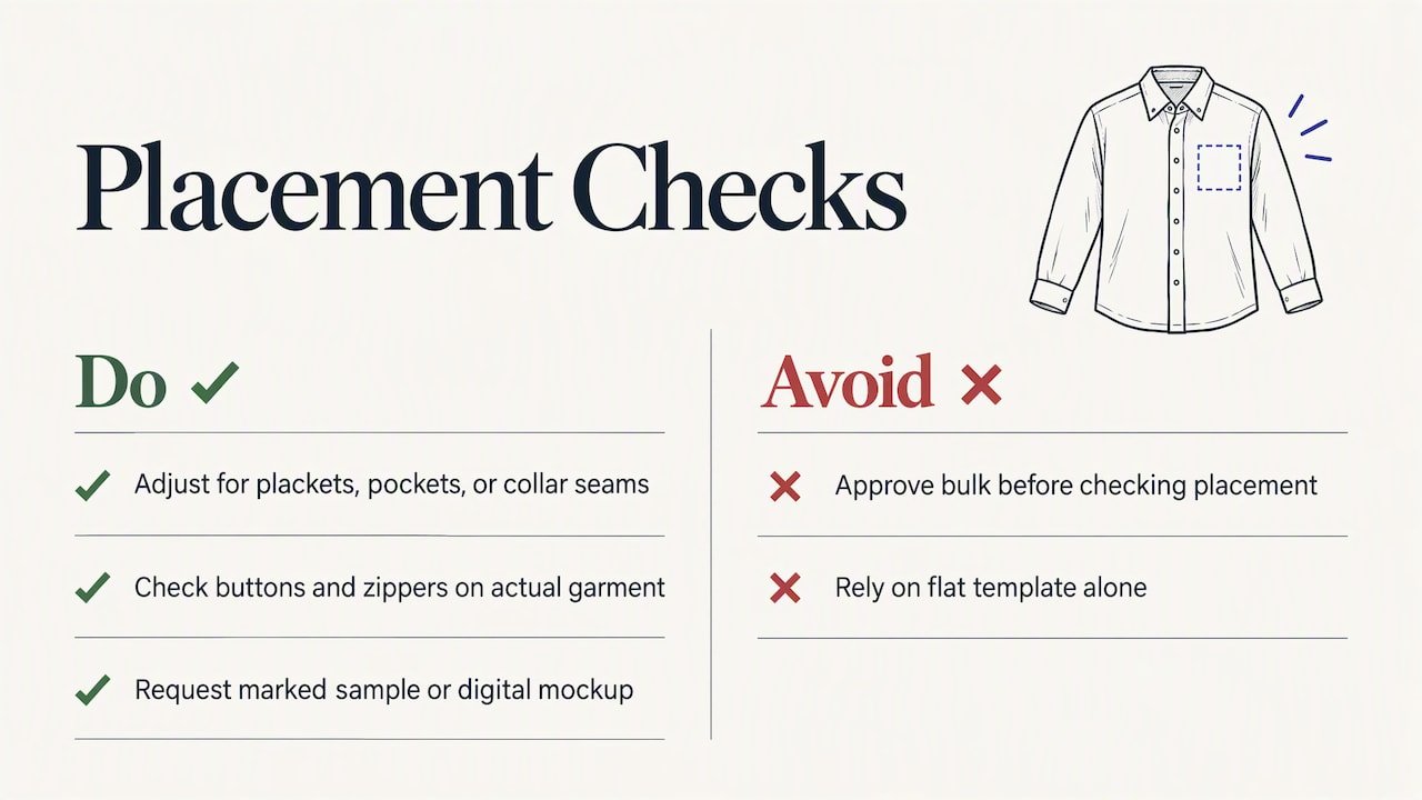
Pro Tip: Always request a physical sample or digital mockup with placement marked before approving a bulk run. A logo that looks right on a flat template can sit differently once the garment is worn.
For more detail on sizing artwork correctly before production, see our guide on logo sizes and pixel specs for merch teams.
How we help you choose placement and execute the order
We walk you through placement decisions with mockups that show your logo at actual scale on the garment you’ve chosen, so you’re not guessing how a left-chest mark or full-front graphic will look before committing to a bulk run. We offer rush order options for tighter event timelines, and we support fulfillment to single or multiple locations.
- Mockup review before any production run begins.
- Sample requests available to confirm placement and color accuracy.
- Rush orders for time-sensitive events or last-minute campaigns.
- Fulfillment support for distributing finished apparel to multiple sites.
Our workflow moves from approved mockup to sample to bulk production to distribution, which keeps placement decisions locked in before the larger order ships.
The simplest rule for choosing your placement
Left-chest is identity. Full-front is impact. If you’re building long-term brand recognition through everyday wear, go small and subtle. If you need a shirt to stop someone mid-scroll or stand out in a crowd, use the whole canvas. Either way, order a physical sample before you approve the final placement.
— Jerry
Get a mockup or sample before you commit to bulk production
Once you know which placement fits your goals, the fastest way to confirm it is to see it on the actual garment. We put together a mockup showing your logo at true scale, whether that’s a left-chest mark on a polo or a full-front graphic on a tee, so you can approve placement before bulk production starts.
- Get a mockup that shows exact placement and sizing on your chosen garment.
- Request a physical sample to check color, texture, and fit in hand.
- Lock in a production timeline, including rush options for tight deadlines.
Visual consistency matters just as much once the shirts leave the box: pairing your chosen placement with brand color choices that hold contrast keeps your logo legible whether it’s small on a chest or large across the front. Ready to see your design in place? Start with our full product catalog and request a mockup today.
FAQ
Do logos usually go on the left or right chest?
Logos are placed on the left chest far more often than the right, following the convention of a suit jacket’s breast pocket. Right-chest placement is sometimes used as a secondary spot when a left-chest logo is already reserved for another mark, such as a team or sponsor name.
Is your chest front or back?
Your chest refers to the front of your torso, between your shoulders and your upper abdomen. In apparel placement, “chest” always means the front panel, distinguishing it from back-of-shirt designs placed between the shoulder blades.
What is the best order to do chest exercises?
This question relates to fitness training rather than apparel design, and falls outside what this guide covers. For garment placement, the relevant order is design approval, mockup review, sample check, then bulk production.
How big should a name be on the left chest?
A name embroidered or printed on the left chest typically runs 2 to 3 inches wide to stay legible without overwhelming the small placement area. Larger text can crowd the space, especially when paired with a logo or icon in the same location.
 Bottle Carriers
 Mugs