

Underbase Screen Printing: How It Works and When to Specify It

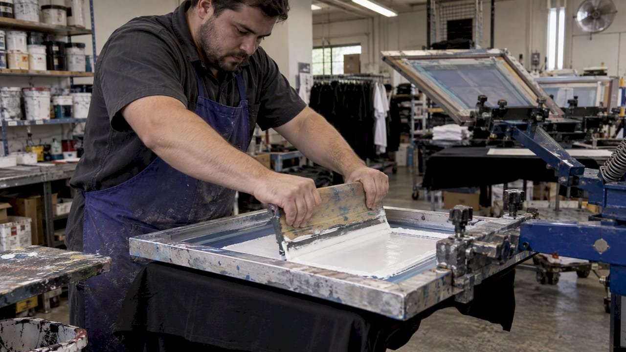
An underbase is a layer of ink, usually white, printed first so the colors on top look bright and accurate on a dark or colored garment. Without it, the shirt’s own color shows through the ink and mutes the artwork. With it, a red logo on a black tee looks red instead of brownish. For the person buying the shirts, the real question is when the extra layer is worth paying for, and when it just adds weight, cost and lead time.
This guide covers how the process works, which inks suit it, how it changes the feel of a print, and what to check on a proof before you approve a bulk run.
TL;DR
- An underbase is an opaque base layer, most often white, printed before the main design on dark or colored garments so the top colors stay vibrant and consistent.
- It is flash-cured, not fully cured, before the next colors go on. Over-flashing causes bubbling, pitting and a blotchy base.
- It adds cost, production time and thickness. A smart printer underbases only the colors that need it.
- Ask your decorator about mesh count, ink type and edge “choke” on the artwork, and request a physical sample on your actual garment color.
- Light garments usually need no underbase at all, so choose garment color and artwork together.
Table of Contents
- What an underbase does
- The underbase printing process, step by step
- When dark garments need an underbase
- Inks for underbase printing
- Hand feel: the tradeoff buyers feel first
- How to prepare artwork for an underbase
- Approving color without over-specifying
- Our perspective
- Ordering underbase-printed apparel in bulk
- Common underbase defects to catch
- FAQ
- Sources
What an underbase does
Screen printing inks are not all equally opaque. Put a bright yellow directly onto a navy shirt and the navy wins. The underbase solves this by laying down a light, opaque, stable surface that the design colors sit on. Industry guidance describes it as a foundation that keeps the garment color from muting or distorting the image.
There is a second job that gets less attention: fiber control. Tiny garment fibers can poke through a thin ink layer, a problem called fibrillation, which makes a bright print look dull, rough or washed out. A printer interview on the Stampinator explains how pressing the flashed underbase flat creates a smooth, paper-like surface so the top colors sit cleanly.
The Printing United Alliance (formerly SGIA) paper Underbases: Why, When and How is blunt about the tradeoff: a proper underbase can prevent a range of garment printing problems, but it can also give the print a heavier hand and add a step to production.
The underbase printing process, step by step
On a typical automatic or manual press, the sequence looks like this.
- Artwork separation. The decorator builds a white (or light) underbase screen from the artwork, covering only the areas that need it.
- Underbase print. The base prints first, usually through a finer mesh than older shops once used.
- Flash cure. A flash unit gels the ink so the next color won’t smear into it.
- Top colors. The remaining colors print over the gelled base, with a flash between layers when colors overlap.
- Final cure. The garment goes through the dryer so the whole stack cures together.
Why the flash step matters
The base should be gelled, not cured. SGIA guidance from 2015 targets a gel temperature of 200 to 220°F (93 to 121°C). Fully curing the base prevents the top colors from adhering well, and over-flashing leads to bubbling, pitting and a blotchy underlay. That is why a print that looks perfect on the press can peel or crack in the wash: the layers never bonded properly.
Choking the base
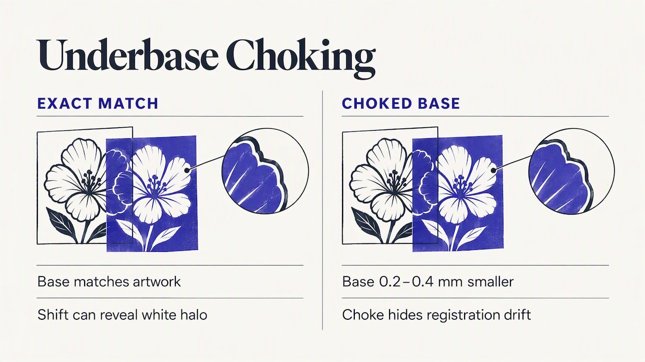
One detail separates clean work from sloppy work. The underbase is normally printed slightly smaller than the top colors, roughly 0.2 to 0.4 mm, a technique called choking. If the base matches the artwork exactly and the press shifts a hair, a thin white halo shows around the edges. A small choke hides that registration drift. If you see white fringing on a sample, this is the first thing to raise with the decorator.
When dark garments need an underbase
The rule of thumb: light garments generally don’t need one, and dark garments generally do for anything bright or light-colored. But “generally” hides a lot of money.
| Situation | Underbase needed? | Notes |
|---|---|---|
| White or light heather tee, any ink colors | Usually no | Ink sits directly on a light surface |
| Black or navy tee, white logo | Often just the white itself | The white may act as its own base |
| Black or navy tee, bright multi-color logo | Yes | The base keeps colors true |
| Dark tee, dark ink (navy on black) | Usually no | Little to gain from a white base |
| Full-color photo-style art on black | Yes, with a different strategy | See the discharge note below |
| Red garment, white and blue logo | Depends on the ink | Dye migration can tint the white |
Some printers apply a base to everything in the design. Screen Printing Magazine notes that many printers “throw in the towel and just underbase everything.” A more careful approach looks at which colors actually need it and leaves other areas base-free, which keeps the print softer and cheaper to produce.
That is a useful question for your own orders. If your logo is dark navy and light gray on a heather gray shirt, you should not be paying for a second screen.
Inks for underbase printing
Most underbases are white plastisol, though water-based and discharge systems are also used for specific looks. What you want from a base ink is opacity, a low profile, and resistance to bleed.
Bleed resistance
Polyester and poly blends carry dyes that can migrate into the ink during curing, turning a white base pink or gray. Printers working on these fabrics choose a low-bleed base. A Reddit thread among screen printers captures the practical warning: use a bleed-resistant base or red garments can turn the whole print pink.
Cure temperature and profile
Ink makers differ here. One supplier lists its low-bleed rapid cure underbase white as curing at 270°F with a low-profile finish and no puff additive. A distributor roundup describes a general-purpose white that cures at 300°F with moderate bleed resistance and works as both a base and a standalone white. Neither is “best” in the abstract. Low-temperature cure suits heat-sensitive blends, while a versatile white suits cotton-heavy jobs.
As a buyer you won’t pick the ink brand, but you can state the fabric and ask the decorator how they handle bleed on it.
Discharge for full-color artwork
Four-color process art on black shirts is the hard case. Transparent process inks don’t bite into a slick plastisol base, and the result can look muddy. According to ScreenPrinting.com, CMYK on black garments is hard partly because standard plastisol bases are thick and need heavy flashing. One alternative they describe is a discharge white base, which removes garment dye instead of sitting on top, giving transparent inks a more natural surface. If your design is photographic, ask whether the shop offers this or whether another decoration method suits the art better.
Hand feel: the tradeoff buyers feel first
Every layer of ink is something your employees or event attendees will feel. A thick white base under a large chest print makes a shirt stiff and rubbery, and people stop wearing it. That defeats the point of apparel as a promotional product.
There are ways decorators reduce this:
- Finer mesh. Industry professionals describe a recurring struggle to balance brightness with softness. Low mesh counts force thick white layers, so modern shops favor higher counts, around 160 to 230, with careful off-contact settings and efficient flashing.
- Pressing the base. The Stampinator-style approach mentioned above flattens the flashed base, which allows higher mesh counts and a softer result.
- Printing less base. Underbasing only what needs it, as discussed earlier.
- Smaller or split artwork. A left-chest logo has far less ink than a full-front print. Our guide to left chest versus full front walks through fabric and artwork checks before you commit.
If softness matters more than a big graphic, embroidery may be the better route. We compare the two in screen printing versus embroidery for apparel and in embroidered polos versus printed tees.
How to prepare artwork for an underbase
Most reprints trace back to artwork, not presses. A few habits prevent them.
- Send vector files with spot colors defined, so the decorator can build clean separations.
- Specify Pantone references for brand-critical colors. Our PMS color matching workflow sets out tolerances brand teams can use to judge a sample.
- Avoid hairline details and tiny type in light colors on dark garments. Thin lines lose edge definition when a base and a top color both print them. Our logo size and pixel spec guide has practical minimums.
- Tell the decorator the garment color and fabric at the quote stage, not after. Fabric content changes the ink choice and the bleed risk.
- Ask about choke on the base for any design with light, thin edges.
It also helps to know the broader landscape. The three main screen printing categories are manual, automatic flat-bed and rotary. Manual and automatic presses typically print finished garments, while rotary presses print continuous rolls of fabric. Promotional apparel almost always comes from the first two.
Approving color without over-specifying
You do not need to dictate the process. You need to approve the result. A workable approval routine for a marketing or procurement team:
- Request a physical sample on the real garment color and fabric, not a digital mockup on a white shirt.
- Check under two light sources: office lighting and daylight. Dark-garment prints can shift.
- Look at edges for white halos, and at solids for fiber poke-through or a gritty texture.
- Feel the print and stretch it gently. A very thick, stiff area signals too much ink or too coarse a mesh.
- Judge the wash result if the shirts are for long-term wear. Our care routine for printed merch shirts is a good one to hand to recipients.
If your team reviews proofs on screens, calibrate what you see. Color management matters even on the photo side of a project, and a studio color profile workflow shows the logic of keeping every display and file consistent before anyone signs off.
Our perspective
We distribute customizable promotional apparel to marketing teams, and underbase questions come up in nearly every dark-garment order. Our view is simple: the best underbase is the one you can’t feel and can’t see.
Buyers tend to make one of two mistakes. The first is asking for “the brightest possible” print and ending up with a stiff shirt nobody wants to wear. The second is choosing the cheapest option on a dark shirt and getting washed-out brand colors. Neither serves a brand.
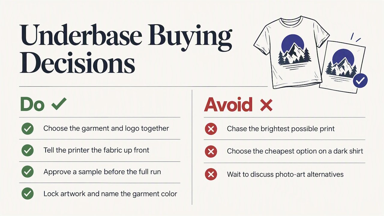
We curate products from trusted suppliers, so what we recommend is to decide the garment and the logo together. If your mark has two colors and sits on the left chest, a dark garment is easy. If you need a large, multi-color graphic across the front of black tees, plan for a base, tell us the fabric up front, and approve a sample before the full run. If the art is photographic, we would rather talk about alternatives early than fix a muddy print later.
For programs that ship to many offices or event sites, consistency across the whole order matters more than perfection on one shirt. That means locked artwork, a named garment color and a signed-off sample.
— Jerry
Ordering underbase-printed apparel in bulk
If you are buying dark apparel for a team, a launch or an event, start from the use case. Our logo apparel buying guide for bulk orders covers quantities, garment choices and timelines, and bulk custom apparel for smarter brand spending looks at where the budget is best spent.
When you are ready to order, Discount Swag offers customizable apparel, drinkware, bags and technology items, with rush ordering, branded kits and fulfillment to single or multiple locations. Tell us the garment color, fabric and artwork, and we’ll help you match the decoration method to the job.
Some products suit a different method entirely. For hard goods like drinkware, see UV printing versus screen printing.
Common underbase defects to catch
When a bulk order arrives, spot-check a handful from different cartons. These are the problems worth flagging.
| Defect | Likely cause | What to ask |
|---|---|---|
| White halo around edges | Base not choked, or press shift | Was the base choked and registration checked? |
| Pink or gray tint in whites | Dye bleed on poly or red garments | Was a low-bleed base used for this fabric? |
| Blotchy or pitted base | Over-flashing | Were flash temperatures controlled? |
| Top colors lifting | Base fully cured before top layers | Was the base gelled only? |
| Stiff, rubbery print | Thick ink, coarse mesh, unnecessary base | Can the base be reduced or finer mesh used? |
| Dull, rough solids | Fiber poke-through | Was the base smoothed or pressed? |
The bubbling, pitting and adhesion problems trace back to flashing, and the SGIA paper cited earlier is the authoritative reference on them.
FAQ
What is underbase in screen printing?
It is a foundation layer of ink, most commonly white, printed before the main design on dark or colored garments. It gives the top colors an opaque, light surface so they look vibrant and accurate rather than taking on the shirt’s color.
Do I need an underbase on a white shirt?
Usually not. Ink prints directly onto a light surface and colors read true. An underbase on a white shirt adds cost, a second screen and thickness without a visible benefit. The exceptions are rare and a decorator can advise on them.
Does an underbase make a shirt feel heavy?
It can. Extra ink adds thickness, and low mesh counts push thick white layers through. Decorators limit this by using higher mesh counts, printing the base only where needed, and pressing the flashed base flat. Ask for a sample and feel it before approving the run.
Is screen printing illegal?
No. It is a standard manufacturing process in the United States. The EPA addresses it mainly through regulation of volatile organic compound emissions from printing chemicals.
Sources
- ScreenPrinting.com: underbase overview
- Printing United Alliance (SGIA): Underbases, Why, When and How
- Screen Printing Magazine: Establishing Rules for Underbase Printing
- ScreenPrinting.com: Jeffrey Fiorucci on the Stampinator
- ScreenPrinting.com: everything you need to know to screen print an underbase
- ScreenPrinting.com: why printing CMYK on black garments is hard
- ScreenPrinting.com: how to print CMYK on black garments with discharge inks
- Reddit r/SCREENPRINTING: Underbase
- Screen Print Direct: Rapid Cure Underbase White
- Fundamentals of Screen Printing (ICT-TEX)
- US EPA: Monitoring Information by Industry, Printing and Publishing
- Dock Street Studio: studio color profile workflow
 Bottle Carriers
 Mugs